UniPort is a technology company that matches students from low to mid-income Asian countries with the right institutions of higher learning in North America. It provides a unique hand-holding experience throughout the college and visa application process, believing that anyone can navigate the process with a little help.
Each year, hundreds of thousands of Nepali students go abroad in pursuit of education. Education consultancies play a key role in the process, but the students often become dependent on them and pay large sums of money. Uniport wanted to put students at the core of its services, enabling them to independently apply for colleges without emptying their pockets.
The team at Black Dove was tasked with creating a new and refreshed look for UniPort's website, including a section for a convention the company was holding. The challenge was to make students feel independent while still providing the necessary support from consulting agencies. The solution was to design a friendly and trustworthy website that would conmnect students with Uniport and assist them through the application process.
As with any project at BlackDove, research was the first step. This included exploring other platforms with similar features to UniPort and extracting information about the company and its audience from the old website and customer data. A mood board was also created to explore possible visual directions. After presenting the research and mood board to UniPort, visual ideas for the website were experimented with.
Experimentations resulted in clean visual design, quirky language to establish the mood, and some illustrations to enhance the website's look and feel. The products were refined and the site was designed to improve the user experience. Product features included a blog page, a university and program finding page, and a membership page. Designs were iterated through multiple feedbacks sessions and milestones.
The end result was a new website that helped UniPort connect with students and assisted students in finding colleges and universities.
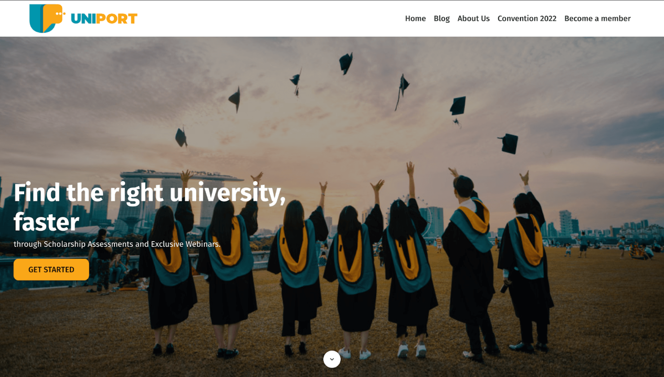
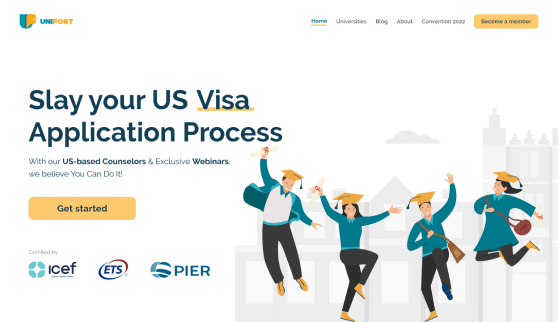
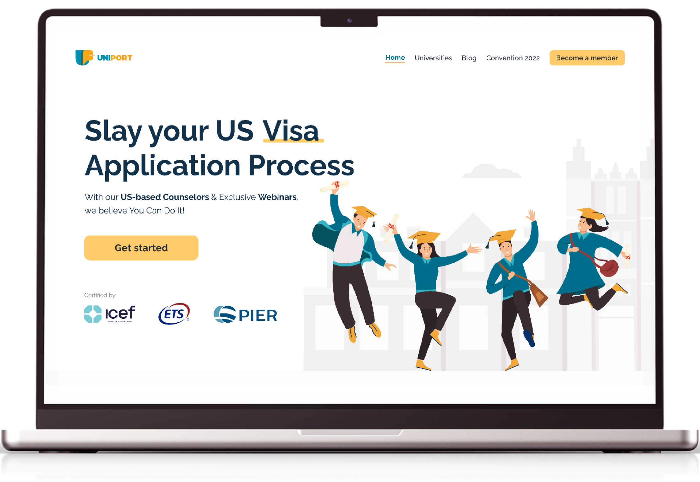
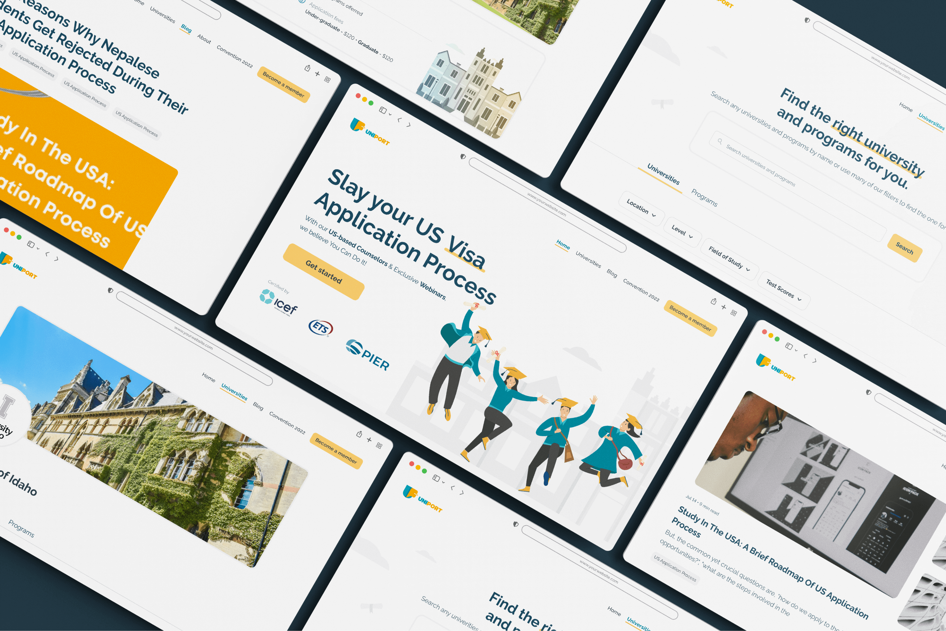
This page is the first thing most users see when they land on Uniport's website. It was designed to catch their attention and connect them with the company. An illustrative approach was used to introduce UniPort, set the tone of the website, and make users feel comfortable with the company's goal of enabling students in the application process.
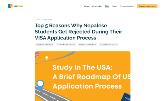
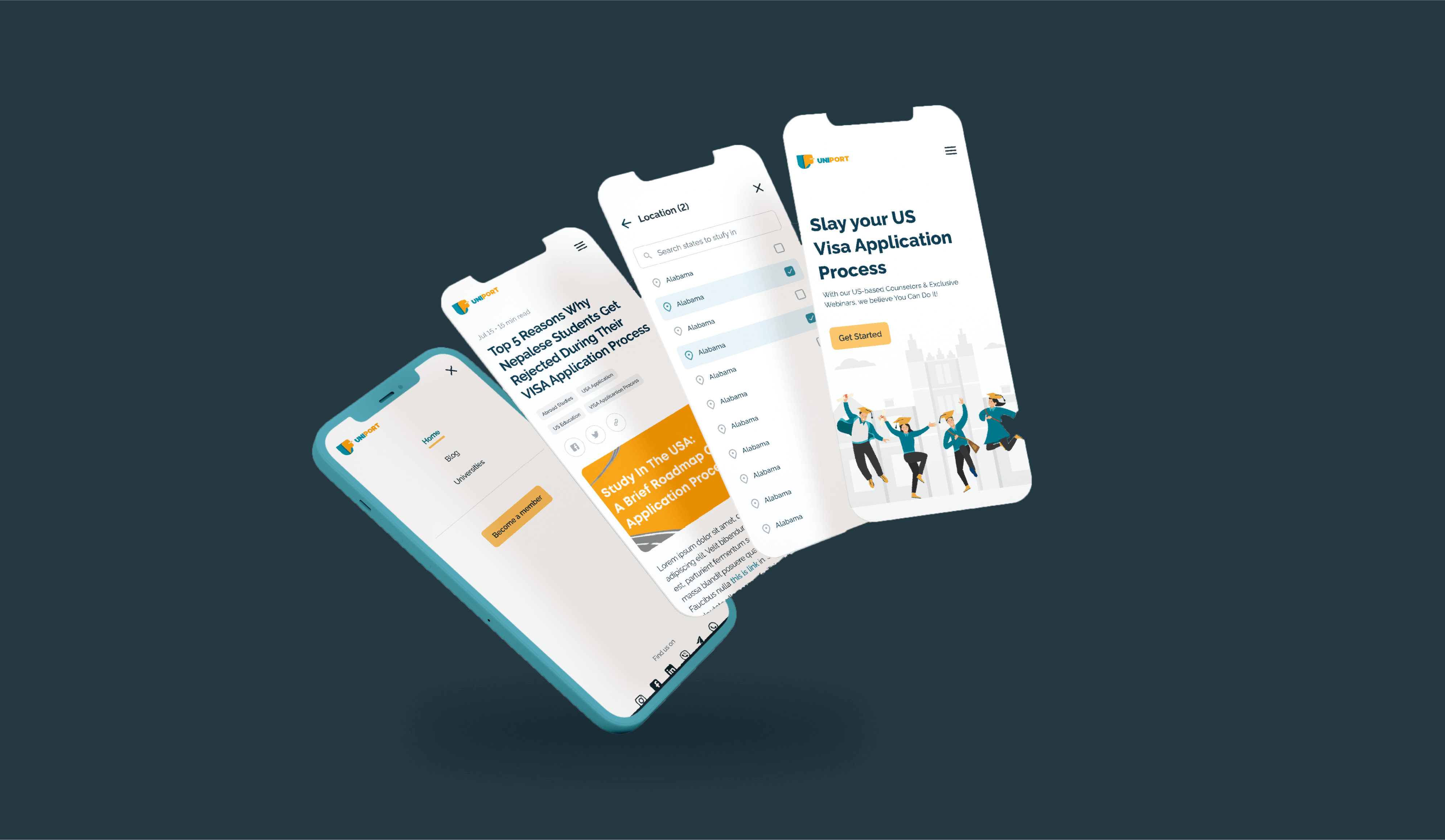
This section of the site features articles that are helpful to students in various stages of the process of studying abroad. A simple tag filter system allows users to easily find articles of interest.
This feature helps students find appropriate universities and colleges, as well as courses. Various filters were designed to meet the specific needs and requirements of students, including filters to help students find colleges and programs they are eligible to attend and filters to allow students to search for programs based on their interests in various fields of study.